Your View
Choosing a movie has never been so easy.

A Project Overview
Year
2023
Team
Solo Project
Grade
89%
This project stemmed from a personal passion of mine, film and TV. I utilised my love of film and TV as a springboard to identify existing problems and found that individuals struggle with recommendations and streaming availability. Once I had conducted this research, I set about creating a conceptual mobile app with an efficient, intuitive and enjoyable experience to solve the problem of infinite scrolling while picking something to watch.
The Problem
Doom Scrolling
To identify the biggest issue when it comes to films and TV I carried out primary and secondary research. For my primary user research I created a questionnaire that considered the users biggest frustrations, top streaming services and most important factors when deciding what to watch. I then conducted secondary user research to corroborate these findings.
On average we spend 19 minutes scrolling on Netflix to find something to watch.
71% of people said their biggest problem was finding where a title is available to watch.
60% of consumers want to transfer their profile between services for more personalised content.
Target Audience
Who was I designing for?
The app was designed for film and TV enthusiasts and by extension people who want to track what they have seen, want to watch, and been recommended ultimately providing a more personalised recommendation service.
Objectives and Metrics
What were the goals?
Create a mobile app with a unique selling point to solve the existing problem.
Design a minimal and aesthetic interface that is intuitive for a range of users.
Integrate a social element to sharing and recommending films and TV.

Research
Empathise
Questionnaire
User Research
Market Research
Personas
Task Scenarios
Task Modelling
User Journey Mapping
POV Statements
Problem Statement
How Might We?
Usability Requirements
Define
Ideate
Cognitive Map
Evaluation Matrix
SWOT Analysis
Idea Refinement
Design & Prototype
Test
Design Guidelines
Card Sorting
Wireframes
Design Elements
Branding
Prototype
Task Orientated Observational Evaluation
SUS
Testing Data Analysis
Research
Identifying the users
I began the project by identifying the target user demographics and their pain points when watching films. I gained the data through a questionnaire with a sample size of 21 people. Due to the sample being on the lower end of what I wanted, I then corroborated the findings with secondary user research. Analysis of this data allowed me to identify the user needs and informed the user personas.
Primary User Research Infographic
Empathise
Resonating with the users
The next stage was to adapt my user research into three actionable user personas.
Users who have an interest in the critical review of films and TV and want to easily track their seen and watch lists.
“ I don’t always trust the reviews on IMDB and Rotten Tomatoes because you don’t know who is rating them. I find recommendations from my family much more valuable .”
Users who avoid large streaming services because they can never find anything to watch.
“It would be great if there was a current list in one place which I could filter for the types of movies and actors I like. ”
Users who enjoy watching films to unwind but feel overwhelmed when finding something to watch.
“There are too many movie to pick from, and once I have decided the streaming limits mean I can’t even watch it. I would love for one place where I can search for movies and see where it is available to watch.”
Once I had completed the empathise phase I needed to outline an actionable problem statement with requirements for the digital product. I began by gaining a deeper understanding of the user, their needs and the relevant insights from the empathise phase. I achieved this using a POV statement and as a result it provided a narrow, actionable and insightful problem statement. Next, I broke this down into smaller challenges using “How Might We?” questions to act as a springboard for the ideation process
Pin pointing the problem and objectvies
Define
o How Might We make it easier and more efficient to select titles to watch?
o How Might We make more personal and informed recommendations for users?
o How Might We allow users to save time when finding a streaming service to watch a particular title?
o How Might We measure the success of the solution?
o How Might We create a unique solution to stand out against competitors?
o How Might We allow family and friends to share their recommendations?
Pin pointing the problem and objectvies
Ideate
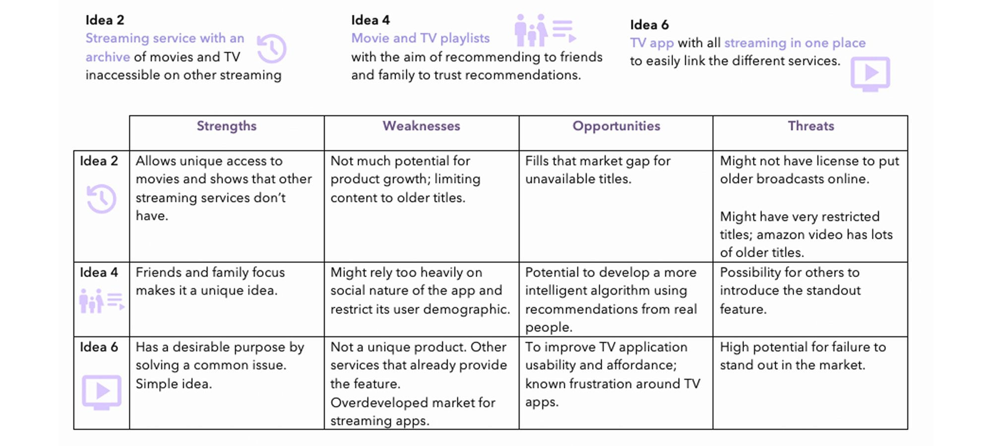
During ideation I identified 6 different ideas from a cognitive map that could potentially solve the problem. I put these ideas into an evaluation matrix and rated them against a set of criteria: originality, usability, feasibility, and stability. I also ranked each criteria with a coefficient from 1-5 that correlated with being the most important (5) and least important (1). The top 3 scoring ideas were then used in SWOT analysis to determine the competitive advantages and disadvantages of the ideas in the context of the market at the time.
Idea Evaluation Matrix
Top 3 Ideas SWOT Analysis

Design & Prototype
Finding the solution
I began finding the solution through my low and high-fidelity wireframes to build a visual concept of what I wanted the key screens to include.
Low-Fidelity Wireframe
High-Fidelity Wireframe
Once I had created the main wireframe screens I knew I needed to carry out data structure testing. I solidified the data structure using closed card sorting. I did a closed card sort with 14 participants to determine the best data structure for the mobile application using the pre-determined categories: Home, Search, Saved, and Profile. The outcome of the this gave me the frequencies that certain cards were placed in the determined categories to contribute to the IA. I was aware that the card sorting did not determine the final data structure; it is simplistic and neglects the task scenarios and user journeys.
The next step was to put the prototype under scrutiny. I recruited six participants, in keeping with the law of diminishing marginal returns, to carry out the usability testing in the most efficient way possible. I began with controlled task orientated observational evaluation using the think out loud protocol to collect both quantitative and qualitative data. The participants were then asked to complete the System Usability Scale (SUS). I analysed all of the data and I have provided the most influential findings below.
Putting Your View through its paces
Testing
Average SUS score
87.5 (Excellent)
Major Take Aways:
Increase icon clarity
Increase user freedom with more shortcuts
Adjust ‘recommendations‘ location in app
Average Task Completion Rate
100%

Design Iteration 2
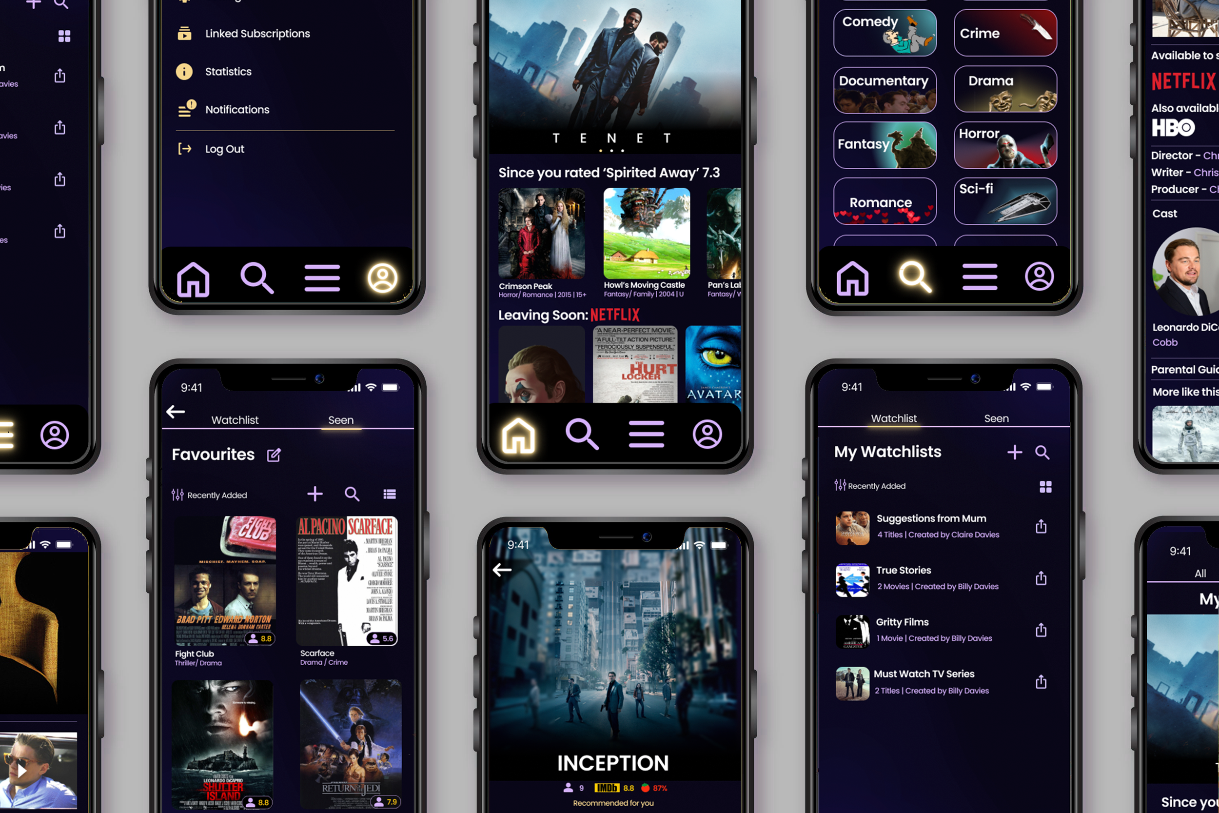
The final design iteration after usability testing alterations.
Upon sign up the user complete the onboarding process and then begin informing the algorithm with their favourite genre, films and TV series.
The users are then greeted with their recommendations which can be quickly filtered into movies and series to increase efficiency and increase user control and freedom.
The user journey within the video outlines selecting a film to watch, adding it to the watchlist and then watching through their linked streaming services. The features within this user journey solves the frustrations of streaming availability and
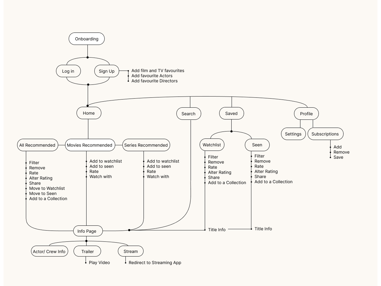
Final reconfigured information architecture.
The user profile gives the ability to link streaming services to the app.
Then, when users are searching for a title, they immediately know if it is available for them to watch and can be redirected to that streaming service. This follows from the user frustration identified in the primary research: not knowing where a given title is available to watch.
Users can also receive notifications when titles from their watchlists are added to their linked streaming services.
Future Recommendations
Moving forwards with Your View
The future developments of this mobile app include the development of a TV application to further compete in the market and solve the issues of bad UX in television streaming applications. In addition, the use of AI to help with the recommendation algorithm could lead to more personalised and specific suggestions for users.


