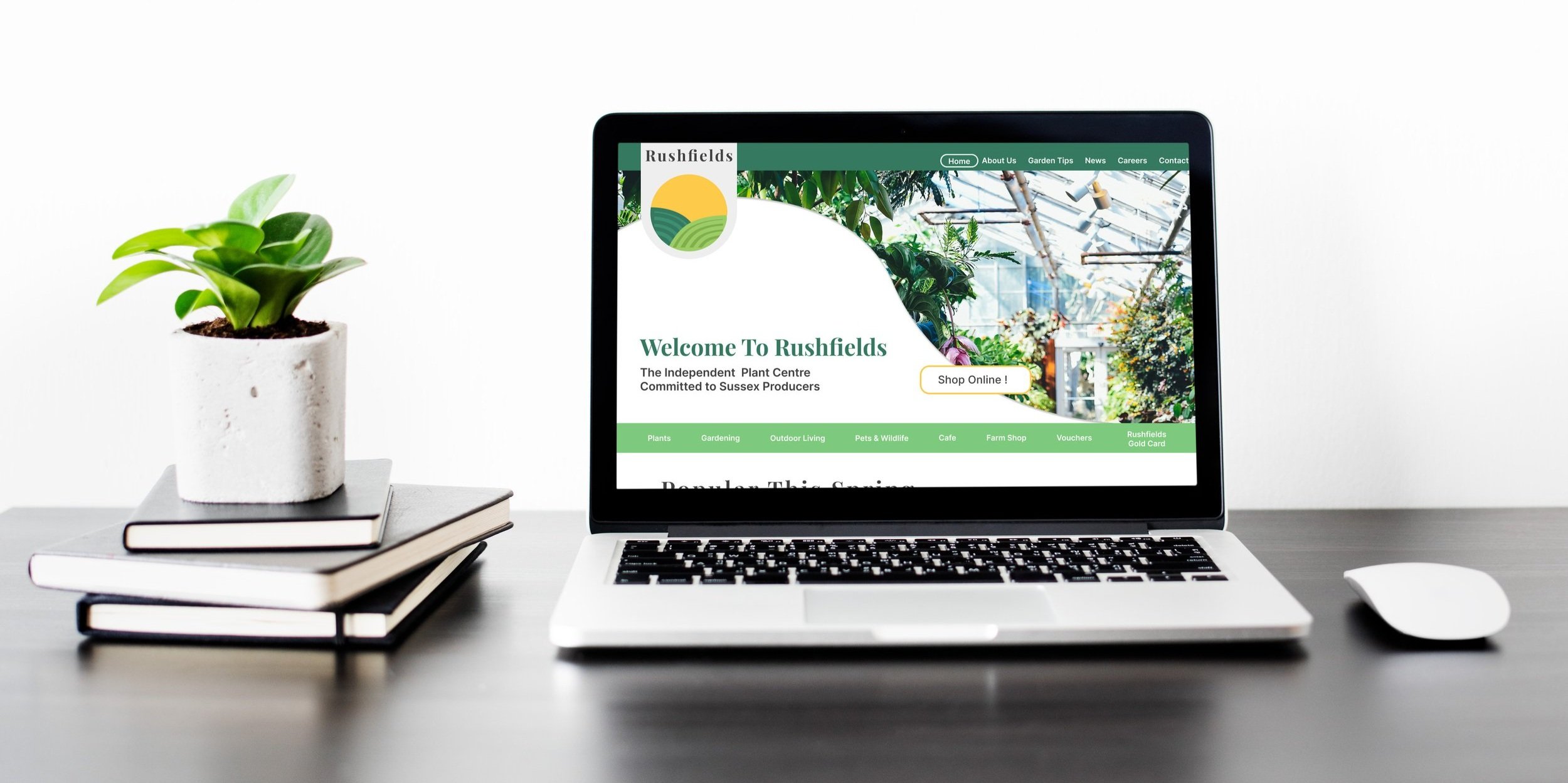
Rushfields
Your local plant centre reimagined.

A Project Overview
Year
2023
Team
Solo Project
Grade
77%
For this project I took on the challenge to redesign the website for my local plant centre. The inspiration for this project began when the COVID-19 pandemic catalysed the digital transformation and internet use became essential in everyday life. I witnessed my grandparents struggling with many websites which led to the realisation that the relationship between information design and older individuals is an under-researched area in user-centred design academic literature.
I began researching and testing the existing Rushfields website where I identified issues with the data structure and interface design. These findings informed the redesign which resulted in a minimal but aesthetic, easily navigable and clear website.
The Original Website
The Problem
Confusing IA and outdated UI
The users face many issues with the structure of the website but also the “overwhelming” and “cluttered” user interface. The central problems were identified as:
The many ways to navigate are unintuitive and confusing.
Users felt that the interface design, while initially fun, was novelty and distracting from the content.
Inconsistent features between pages and cluttered layouts.
Brand identity required modernising.
Target Audience
Who was I designing for?
After market analysis and looking at garden centre website analytics I was able to identify that I was designing for the age brackets of 25-34 and 65+. These were people who require guidance due to a lack of gardening knowledge or website experience.
Objectives and Metrics
What were the goals?
Simplify the website data structure to increase easy of navigation resulting in 90% task success rate.
Design an aesthetic interface to increase the usability of the website by 80%.
Increase positive user experience to result in 80% positive takeaways.
My Process
Formative Testings
Identifying original site flaws
To begin the redesign process I needed to identify where the weaknesses manifested in the original website. After researching many evaluation techniques I selected task oreintated evaluation, SUS, product reaction cards and heuristic evaluation. This enabled me to collect quantitative and qualitative data and they score highly against Chronbach’s Alpha meaning that they provide consistent and reliable results.
Only 1/4 of tasks had a 100% success rate. All tasks had an average error rate of 1.7 or higher.
44.17 on the system usability scale ranking it as “poor”. Significantly below the 68 score average.
53% of product reaction cards were negative.
This word cloud depicts the adjectives selected by participants to describe the original site. The larger words were most frequent.
Market Research
How to face up to competition
The next step was to gain an understanding of how the Rushfields website compared to local competition. I created a table to compare the strengths and weaknesses of exiting sites and compared the website analytics that were available.
Rushfields had a bounce rate of 77% demonstrating that the landing page did not retain visitors or encourage them to venture past the first screen.
More successful sites had a bounce rate of around 35%. It was important to bare in mind that these sites are established chain garden centres while Rushfields is an independent family run business. However, I was able to draw inspiration from the design of their the IA and UI.

The Redesign
The steps to creating a better website
From the usability testing of the original website, I collated all of the findings into a list of alteration that needed to be made to the information architecture and visual design elements. I was then able to further define the usability requirements with guidance from Schniederman’s 8 rules of usability. This allowed me to create SMART goals to further assess the success of the redesign.
Ideate
Reimagining Rushfields
I began the ideation process by workout a new information architecture and navigation design; this was one of the most frequently mentioned issues during the formative testing. This was also the where the first challenge began in the redesign process; the original IA was so overwhelming that redesigning and testing the new structure took up more time than anticipated. However, this issue was mitigated by reassessing the remaining time before the deadline and altering the allocated time for the outstanding tasks.
The IA was informed by a closed card sort with 17 participants organising the existing pages into 8 newly defined categories (News, Plants, Gardening, Outdoor Living, Pets & Wildlife, Cafe, Farm Shop, and Vouchers) . The data was then processed and organised by the frequency that each card was places in each category.

For the testing of the redesign I recruited 6 participants due to the scale of the project and the law of diminishing marginal returns, including:
2 UX experts to carry out additional heuristic evaluation.
2 gardening experts, one 80 year old male and one 45 year old female.
2 individuals with no background in either gardening or UX.
The usability testing methods were the same as the formative testing: SUS, task orientated observational evaluation, and product reaction cards.
How did the redesign hold up under scrutiny?
Summative Testing
The bar chart demonstrates that there was a decrease in the average task completion time between the formative and summative testing. This highlights that the redesign was successful in creating a more intuitive and efficient website. The most significant decrease in average completion time was a 51% for Task 2: “Add two eucalyptus plants to the basket and check out”.
The SUS score also saw a 115% increase from a score of 44 for the usability of the original website to 95 for the redesign. In addition, the product reaction cards saw an increase from only 44% of cards being a positive reaction to 100%.
While reflecting on the successes and failures of this project I first turned to the objectives. All of the metrics were exceeded which demonstrates the success of the redesign, but allows room for scrutiny. In future, the redesign would need to undergo a further iteration of testing to corroborate the initial redesign test results. Furthermore, more focus could have been given to the business context of the site to improve its chance of success against competition, however, it was vital to resolve the major issues that were highlighted during the formative testing which maintained a focus on branding and website data organisation.
Ultimately, the metrics and objectives were set with the time and resource constraints of the project in mind. Therefore, the Rushfields redesign exceeded expectation and provided an efficient and usable website with a modern, and aesthetic interface.
Did the redesign fulfil its potential?
Reflection


