Recover
You are only one person but we can't do it without you.
A Project Overview
Year
2023
Team
Solo Major Project
Grade
87%
This was my final project for my UX Design Masters. I decided to focus on the experience of eco-anxiety. With the climate crisis becoming ever more pressing, so does the frustration of the limits of individual impact.
When I began this project I wanted to focus on the climate crisis; being a topic of such social and political importance I wanted to contribute to the solution. I focused on the problematic feeling that there was is nothing that the individual can do to help impact the climate crisis on their own.
Eco-Anxiety and the Climate Crisis
The Problem
78% of people have some level of fear of climate change.
The top 5 feelings of people when they see climate change media include:
Frustrated
Pessimistic
Sad
Sacred
Overwhelmed
70% of 16-24 years old are worried about climate change with 25-49 year olds following closely at 67%
Target Audience
Who was I designing for?
The app was predominantly designed for 16-50 year olds who have the greatest proportion of eco-anxiety and want to be proactive in reducing the personal feeling that they cannot make an impact on the climate crisis.
Objectives and Metrics
What were the goals?
Decrease user’s short and long-term eco-anxiety by at least 10%.
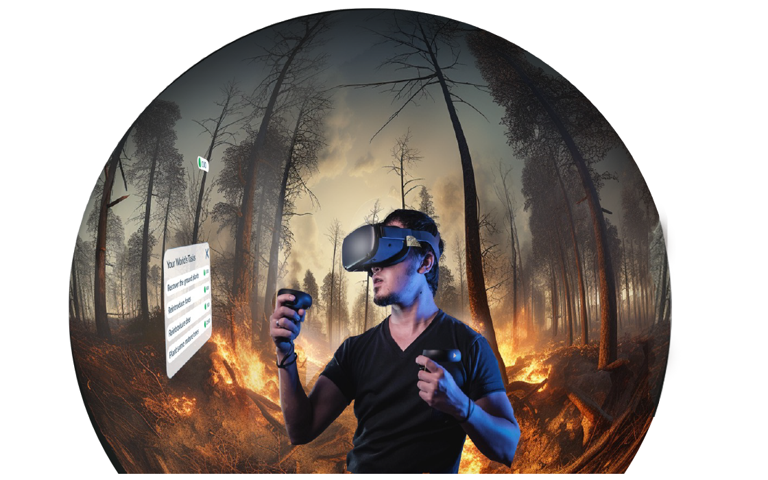
Design an XR product that allows an immersive experience for users.
Use gamification techniques to motivate users to engage in sustainable habits.
Background Research
Gaining an informed perspective
I began the project by conducting a literature review to gain a deeper understanding of the individual’s place in the climate crisis, eco-anxiety’s increasing relevance amongst academic discussion, and the existing use of interactive technology solutions within the remit of sustainability projects.
Market Research
Standing up to the competition
The next step was to understand the existing market products and what they offered. I considered websites and mobile apps at this stage; I did not want to limit the platform of the digital product early on. The majority of mobile products offer daily sustainability tasks with a focus on reducing the individual carbon footprint, whereas the websites provide information to encourage sustainable habits and building a narrative around the negative feelings.
Feature Comparison of Mobile Apps
User Research
Identifying the users
While I was conducting background research I had created a questionnaire to gather some primary user research about the main focus points for the project. I have included the summary user research infographic below.
Primary User Research Infographic
Interviews
An expert’s opinion
To gain a deeper insight through real-world perspective and technical advice I conducted an interview with an expert in renewables and sustainability. I also interviewed a potential user to understand how they felt about methods to reduce eco-anxiety and XR technology. The central takeaway was that there should not be major pressure on the individual to solve the climate crisis but that they should be encouraged to be actively sustainable by voting, lifestyle changes and considering if their income is from green sources.
Define
Enhancing user-centred thinking
The next step was to define the problem statement. I began by creating an empathy map to identify a more specific user through a focus on their actions, concerns and emotions grounded in the previous research. Then, I utilised the empathy map, personas and user journeys to define and reframe the design challenge into an actionable problem statement using a Point Of View structure.
Finalised problem statement:
An individual worried about climate change needs support to reduce their eco-anxiety, motivate sustainable habits and reassure their level of engagement.
To finalise the define stage of the project I needed to set the aims and objectives. Using the SMART objectives framework I was able to ensure that the aims of the project were realistic, achievable and outlined a definition for success within the project.
This ultimately allowed me to keep the project moving in the right direction with the objectives and aims are the forefront of my attention.
I carried out the three sub-phases within my ideation process: generation, selection and development. I began with a brain dump which developed into a mind map. The mind map organised the ideas into a parent-child relationship hierarchy with the highest level categories correlating to the overall project goals. Next, I ranked the summarised ideas using an evaluation matrix and SWOT analysis to finally arrive at the selected idea which proceeded to be refined and developed.
Findings new ways to tackle the problem statement
Ideate
Mind Map
View a virtual world that demonstrates what a planet could look like if everyone lived like you.
Design
Bringing the idea to life
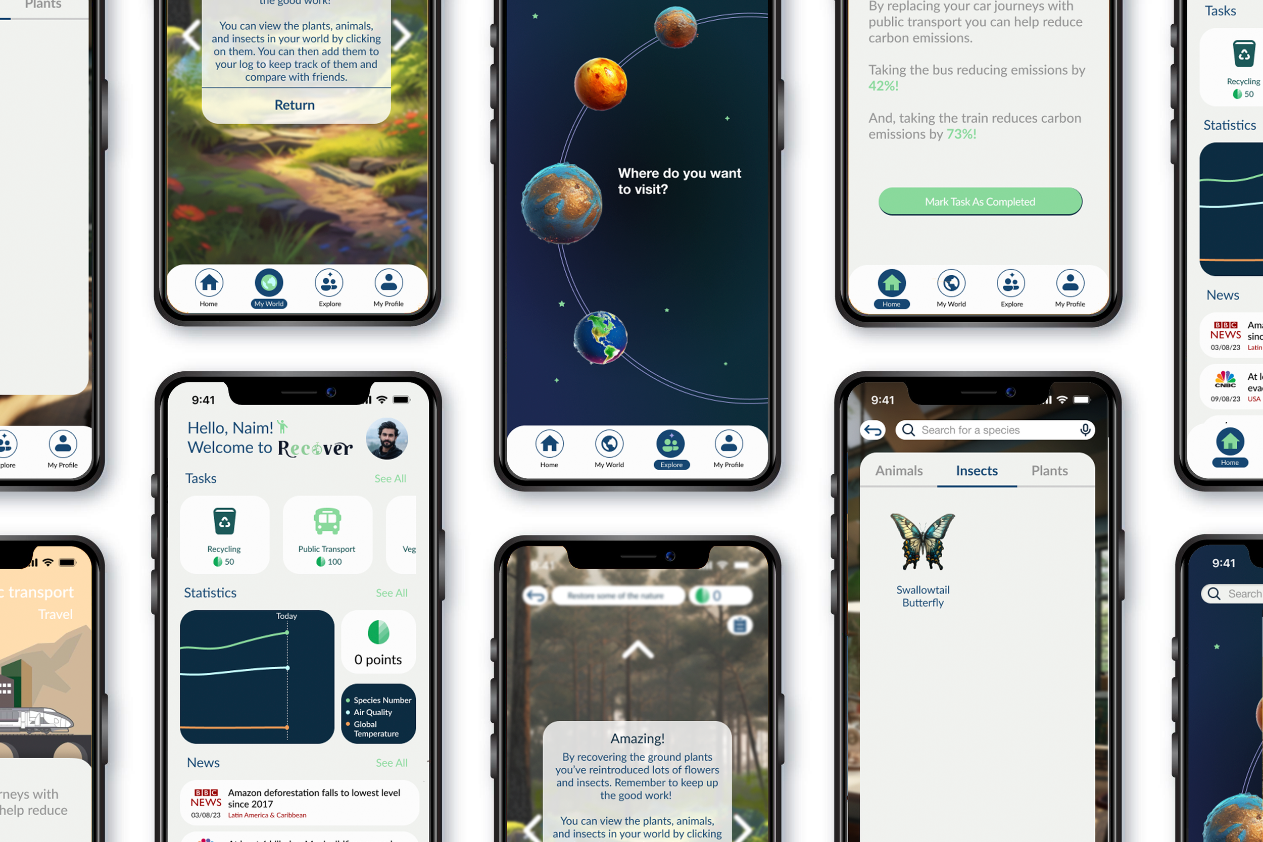
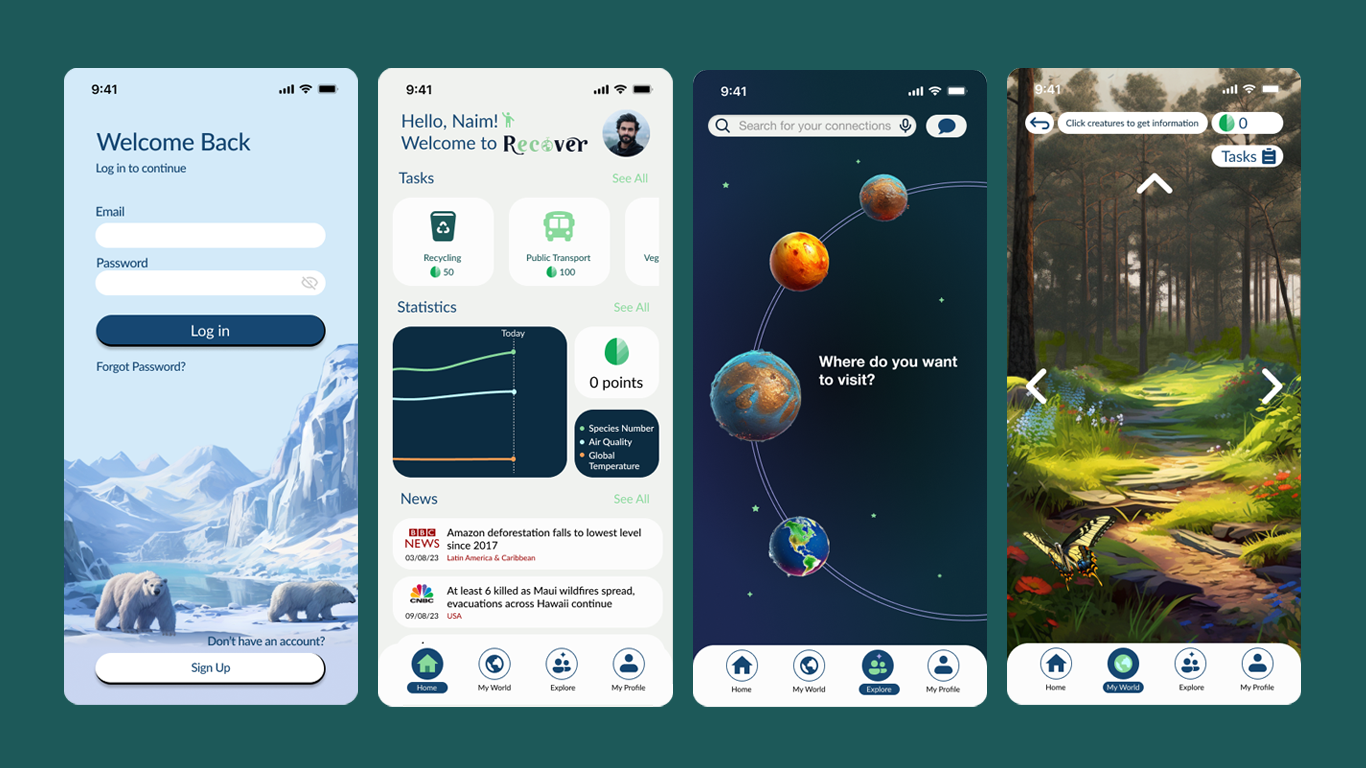
Design started with deciding the platform I was designing for. After the research and final idea selection I felt that a mobile app was the best option because it suited the nature of tracking daily tasks. A mobile app also allows the VR elements to be integrated into the design.
I conducted data structure testing by open card sort with 15 participants to determine the information architecture. The final IA was designed with two main principles in mind: reduce user cognitive load, and provide multiple routes through the app for the user to complete their goals.
App Information Architecture
Once the IA was confirmed I began the low and high-fidelity wireframes. While I was designing the wireframes I was referring back to my previously outlined 10 usability heuristics as defined by Jakob Nielsen to ensure that the interface was as accessible, intuitive and provided the best user experience possible. At this point I also took the time to consider the heuristics for VR requirements.
Low-Fidelity Wireframe
High-Fidelity Wireframe
I decided on design elements that were very in keeping with the primary goals of the app, to reduce anxiety and promote sustainability. The calming colour palette aims to aid the reduction of anxiety but also carries an undertone of nature and new life. The typeface is also great for on-screen legibility and its geometric sans serif nature brings a sense of balance and stability furthering the apps aims.
The next step was to put the prototype to the test against the SMART objectives. I considered biometric testing to measure anxiety, however I did not have ethical approval incase there was an unintentional increase in user anxiety while using the app. As a result, I identified two eco-anxiety Likert scale questionnaires to quantify the user’s long (Hogg’s Eco-Anxiety Scale) and short term (Climate Change Anxiety Scale) eco-anxiety. Participants completed the short and long term eco-anxiety questionnaires before testing began. Then they completed the short term eco-anxiety questionnaire immediately after using the interface.
In addition to the eco-anxiety measures, I conducted task orientated observational evaluation collecting quantitative data (task completion time, error rate) and qualitative data (comments through think out loud protocol and visual observation). Participants were also asked to fill out a SUS questionnaire at the end of the testing before the verbal debrief for additional comments and user satisfaction rating.
This whole process was repeated twice with a two week period between testing iterations. This allowed the alterations informed by the first iteration of testing to be evaluated and meant that user’s long-term eco-anxiety could be measured.
Could Recover reduce eco-anxiety?
Testing
Average SUS score
94 (Excellent)
Average decrease in short-term negative climate emotions
35% Decrease
Average User Satisfacition
4.8/5
Average decrease in long-term eco-anxiety
27% Decrease
Major Take Aways:
100% of original metrics and deliverables were met or exceeded.
Participants verbalised feeling calmer whilst interacting with the interface.
Very few usability issues left by second testing iteration.
Average SUS score remained the same between testing iterations .
Average user satisfaction increased by 0.2 between testing iterations.
Overall, the test results demonstrate that Recover delivered and exceeded the measurable objectives outlined in the define stage. The results for reducing user eco-anxiety long-term cannot be entirely attributed to the application, however, if the constraints of the project had permitted it the testing would have included biometric testing and use of the application between testing to increase reliability.
Future Developments
Recover and future eco-anxiety
With the topic of climate change only increasing in relevance, the future of recover remains very bright. The next steps would be to revisit the personas for the application and consider non-human personas; it is become more important to design for the environment and ecology. Also, using green software development processes, improving the user experience while decreasing the carbon footprint of the technology, for example, shorter user journeys, intuitive click paths and sustainable interface options.
Furthermore, to increase accessibility and the potential of the gamified nature of the mobile app, Recover would come to desktop in future. Also, developing brand deals and advertising campaigns to extend the reach of the product to different audiences would not only increase the success of the app but generate new objectives: to generate a community that are increasing their sustainable habits, or branch out into industry as a tool to reduce companies carbon footprint.
Want to see more of my projects?
